
|
|
|
|
|
It is common
for us to shape our images with an S shaped curve. This is such common
practice it is quite possible that we've never really wondered exactly
what it is that we're doing, and why it's not the right thing to do.
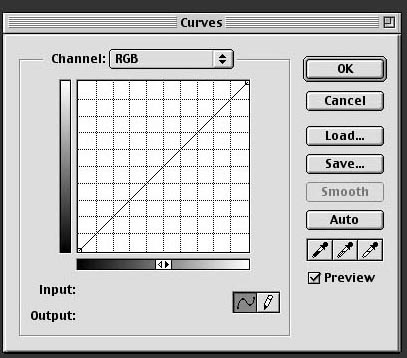
W The digital
sensor is linear in its response to light. This means that each and
every increase in brightness carries with it the identical increase
in contrast everywhere along the response from highlight-to-shadow.
The contrast response in the darker areas of the image is identical
to the contrast response in the highlight. This response is illustrated
below, right, in Photoshop's initial Image>Adjust>Curves dialog. It
shows that contrast is unchanged from shadow up to highlight. While
this is the digital sensor's native response, it is almost always to
be avoided if we want our image to render as a "pretty" picture.
It is perhaps common to use the S curve because viewing the image on the computer monitor might make us think that pushing up the near high values and pushing down the near low values makes more contrast in the midtones. If you look at the S curve illustration, youÕll see a more vertical straightline section in the S curve. On the monitor, this often looks more pleasing. I'll make a guess that the monitor has some responsiblilty for the common use of the S curve. The monitor has a fundamental difference in the rendering of images as compared to our printed images, the monitor is transmissive, rather than reflective. The light that you see when looking at the monitor is emissive. The light you see when looking at printed images reflects off the paper. This is another hint, do you now know why the S curve is fundamentally problematic? We might perhaps ruminate a little about how human vision works, which will give us another clue as to why the S curve is impractical, especially when applied to images that will render on reflective surfaces. In thinking about how we see contrast relative to light energy, we humans see light energy differently when brightness range changes. Our ability to see contrast is directly related to the amount of light available. Additionally, if there are adjacent reflectances of fairly divergent brightness, we see the lower valued light energy more poorly than the brightly reflecting light energy. Consider a single candlepower such as a match struck in a closet. Our eyes adjust and we see somewhat normally. That same single candlepower when placed in the fenderwell of a car in bright sunlight has almost no effect. This illustrates how we see light energy, and why we need additional contrast in low valued reflectances, especially when the low value that has little light energy reflecting from it is adjacent to a substantially higher valued reflectance. Our S curve actually replicates a problem weÕve had with film for some time, the problem of adjacent contrast on the toe of the curve. Ansel Adams taught us to place low valued contrast higher on the curve, and to subsequently push that better separating, almost-three-quartertone, down to where we originally wanted the reflectance to render. Ansel's technique provided a workaround to getting the contrast where he wanted it on the print, thus avoiding film's inherent threshold problem where contrast just above the shadow wonÕt separate because these values don't have enough light energy to have useable development potential. The digital sensor's linear response to light makes the S curve's replication of our film struggle, a questionable practice. Why make with digital, the problem we've struggled with all these years? Why make lighting more difficult? Indeed, if we make an S curve we make our job of lighiting low values more difficult because we guarantee that our lighting effort makes less contrast in the place that needs more contrast. An S curve really doesn't make much sense if we look at what it does and how it complicates our job. |
|
|

 hen
we shape, or 'tone' our images, the intent is to provide a contrast
enhancing remap of the densities. Following the characteristic curve
of film, why wouldn't we mimic film's response when crafting our images?
It seems like it might be practical to follow in the way film is shaped.
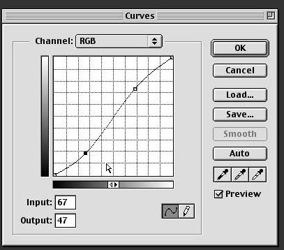
The curve illustrated at left is a common implementation, it is taught
and talked about by many of today's top teachers of how to use digital
image editing software. There is however a minor, but missed concept
that you may not have thought about, and that is the response of film,
specifically at the shadow end of film's response. As some of you may
have guessed I've so far given some food for thought regarding what
might be the problem with the S curve, and indeed, the illustration
above is exactly the problem with using the S curve. And yes, you're
supposed to think about what is so diabolical about using an S curve.
Have you guessed (or better yet, figured out why we don't want to use
it)? Perhaps we could talk about the response of the digital sensor
as compared to film's response. Actually, when shaping film, we should
be even less inclined to use the S curve, which if you've guessed the
answer to our riddle, is fundamental to the problem we're exacerbating
by using an S curve on film's typical characteristic response curve.
hen
we shape, or 'tone' our images, the intent is to provide a contrast
enhancing remap of the densities. Following the characteristic curve
of film, why wouldn't we mimic film's response when crafting our images?
It seems like it might be practical to follow in the way film is shaped.
The curve illustrated at left is a common implementation, it is taught
and talked about by many of today's top teachers of how to use digital
image editing software. There is however a minor, but missed concept
that you may not have thought about, and that is the response of film,
specifically at the shadow end of film's response. As some of you may
have guessed I've so far given some food for thought regarding what
might be the problem with the S curve, and indeed, the illustration
above is exactly the problem with using the S curve. And yes, you're
supposed to think about what is so diabolical about using an S curve.
Have you guessed (or better yet, figured out why we don't want to use
it)? Perhaps we could talk about the response of the digital sensor
as compared to film's response. Actually, when shaping film, we should
be even less inclined to use the S curve, which if you've guessed the
answer to our riddle, is fundamental to the problem we're exacerbating
by using an S curve on film's typical characteristic response curve.
 By
understanding that as the line moves upward, it can make more or less
contrast if the line bends. If the line bends more vertically than the
linear 45 degrees, it makes more contrast. If the line bends less vertically
(and more horizontally) it makes less contrast. Understanding how the
bending line affects contrast gives us the clue to why we don't want
to use the S curve.
By
understanding that as the line moves upward, it can make more or less
contrast if the line bends. If the line bends more vertically than the
linear 45 degrees, it makes more contrast. If the line bends less vertically
(and more horizontally) it makes less contrast. Understanding how the
bending line affects contrast gives us the clue to why we don't want
to use the S curve.